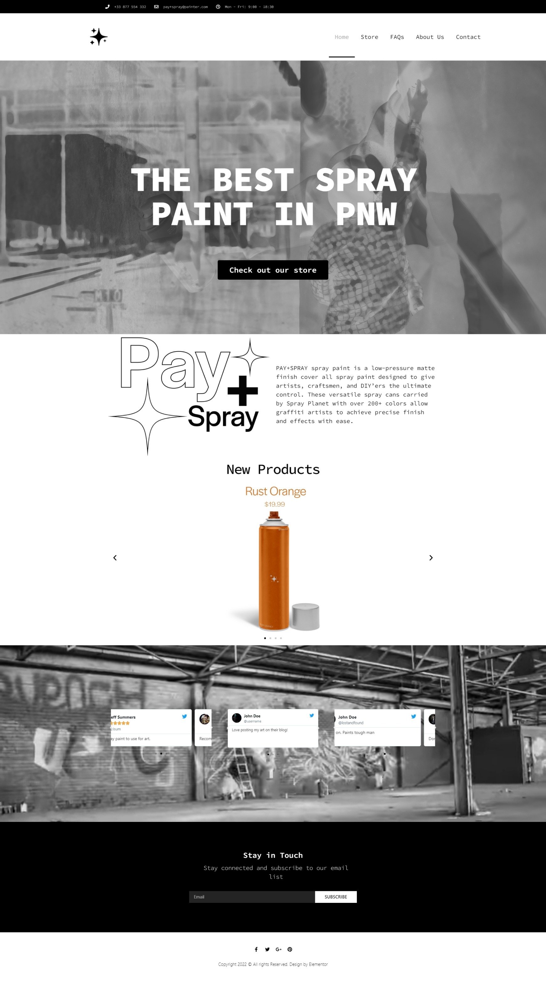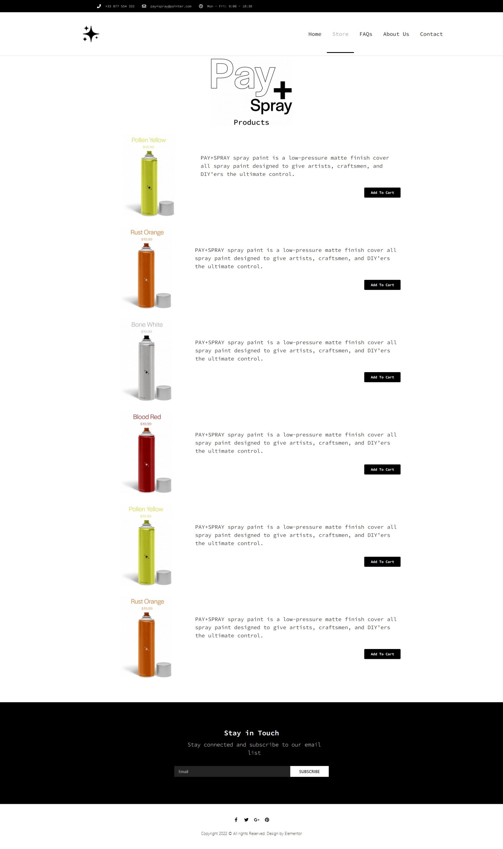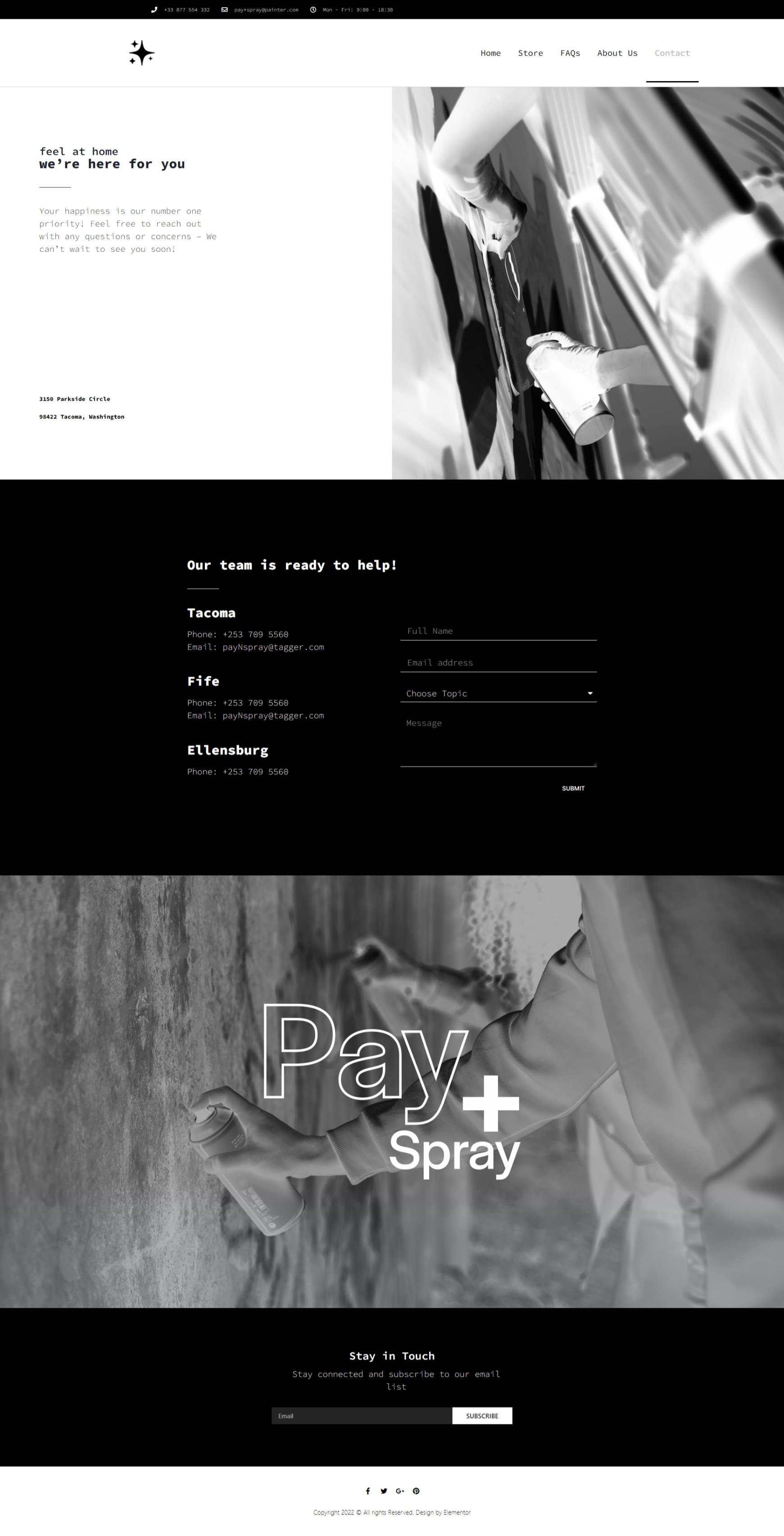
Pay + Spray
Ecommerce Web Design
To begin the process, I dedicated several weeks to researching competing brands, studying their styles, color palettes, and design choices. This deep dive into the market trends helped me gain valuable insight into what was popular, what resonated with consumers, and what gaps existed that I could fill with my own approach. By thoroughly understanding the visual language of established brands, I was able to determine the direction for my own website and brand identity, ensuring that my work would not only stand out but also appeal to a modern audience.
After the rough designs were done I moved on to the spray cans you see below. I noticed how convoluted and complex many brands make their cans and paint, so to contrast that I made it as minial and clean as possible. On the cans themself, we see the mock up of Pay+Spray paint cans along with its logo. These were expanded upon to create four total colors, which are off to the right.
Once the initial designs were sketched out, I shifted my focus to the development of the spray cans you see below. During my research, I observed how many brands tend to overcomplicate their product packaging with excessive design elements and cluttered information. In contrast, I sought to create something sleek, minimal, and functional—designs that communicated simplicity without sacrificing appeal.


