WeCycle Recycling Company
Branding
WeCycle is a recycling initiative designed to address the specific needs of college campuses, with the goal of fostering a more sustainable environment for students. After living on a university campus for several years, I observed that recycling efforts were nearly non-existent, particularly in smaller college towns. With this in mind, my team set out to tackle the recycling challenges plaguing these communities. Over the course of eight weeks, we developed logos, conceptual designs, and conducted extensive research into our stakeholders to ensure that WeCycle would be both practical and impactful.
In developing the visual identity of WeCycle, we chose a color palette centered around blue and green. This decision was grounded in color theory, as these hues naturally evoke associations with the earth, sustainability, and reassurance. Blue, with its connotations of trust and stability, reflects our goal of creating a reliable and dependable service for students. Green, symbolizing renewal and growth, reinforces the environmental mission of WeCycle. Together, these colors remind the audience of our core values—recycling, sustainability, and care for the planet—while creating a visual connection to the natural world that we seek to protect.
One of our key deliverables was the creation of a mock office space to visualize how WeCycle offices could integrate into various campus environments. These offices would serve as hubs where employees could address recycling inquiries, manage subscription services, and handle other operational needs. The office design was conceived to reflect the approachable, community-driven nature of the initiative, reinforcing our commitment to making recycling accessible and efficient for students.
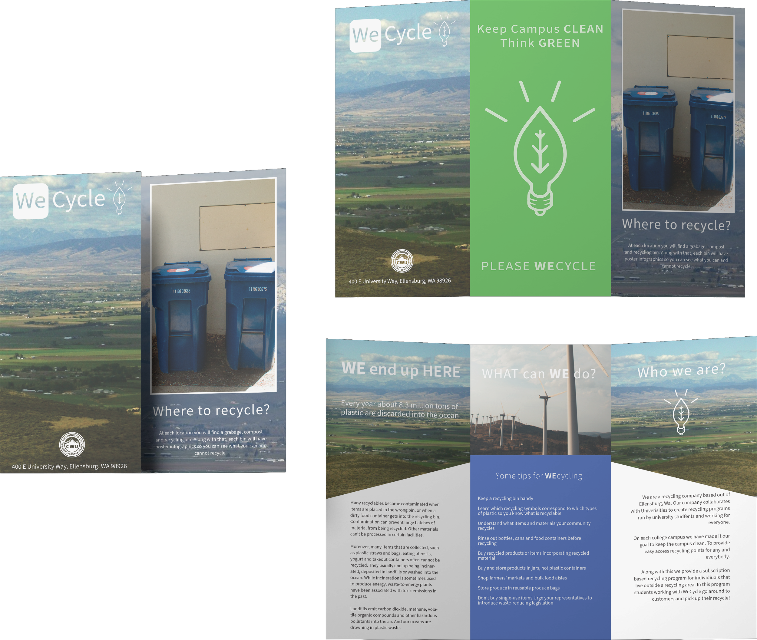
We also created a variety of branded mockups for additional assets, including reusable water bottles and garbage trucks, all bearing the WeCycle logo and color scheme. These mockups not only extended the visual identity of the company but also served as tangible reminders of the importance of recycling in everyday life. Each element was thoughtfully designed to connect with our audience, both visually and practically, further embedding WeCycle’s brand into the community’s daily routines.


